


Strategy, tone of voice, visual identity, website and advertising for a brand designed to help Brazilians invest better.
MADE AT XP INC. IN 2017, 2018 / ROLE: CREATIVE DIRECTOR, LEAD DESIGNER, BRAND STRATEGIST / CLIENT: XP INC.
—
A few years after successfully implementing the new business model, the brand was having a hard time taking its awareness to the next level. The problem? Despite its new features, XP still couldn't keep up with the high street banks, which kept 99% of Brazilian investment assets under their management.
Over the previous decades, these massive corporations had been spending billions in advertising and taking advantage of the population’s lack of financial expertise to offer high-fee products with lousy returns.
It was time for a big change.
From 2017 to 2018, I was in charge of rebranding XP Investimentos from its core, delivering a new positioning combined with comprehensive brand guidelines and effective advertising.

Previous Logo and Visual Identity
Refreshed Assets

Brand Guidelines Summary
Brand Spot — Turn on CC for English Subtitles
Investing in unique relationships —
STRATEGY AND CONCEPT
XP’s new positioning was built to re-establish the brand as Brazil’s true investment expert and reinforce its mission of helping everyone invest better outside banks.
The first goal was to make the brand talk to its audience on equal terms. To help achieve that, “Investindo em Relações Únicas” (Investing in Unique Relationships) was chosen as the main creative concept. In addition, XP’s pillars and attributes were reviewed and then translated into a new, trusted tone of voice.
—

Brand Framework

Brand Strategy Workshop

Persona Profiling

A minor update. A major change —
LOGO
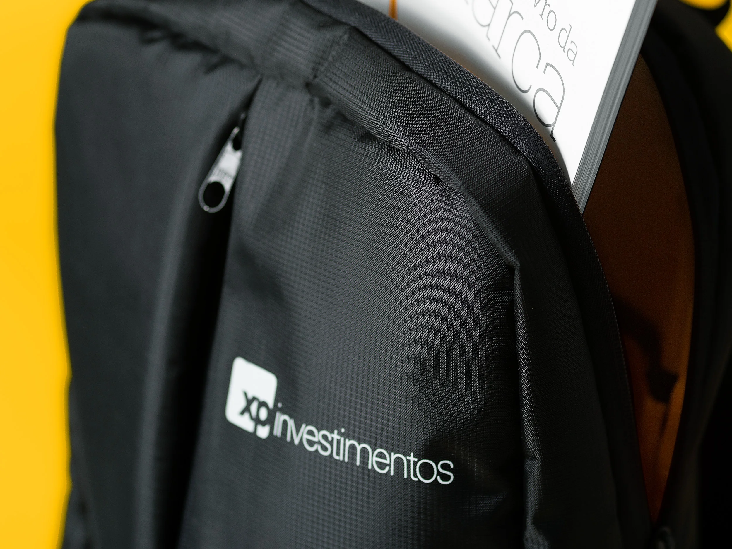
The dull blue of the previous logo was replaced with a rich black. The wordmark had its legibility optimised, and the “corretora” tagline was removed from the lockup to portrait XP as a more diverse business. A new shorthand version of the logo was also designed to improve responsiveness in different media.
—


Natural sophistication —
COLOURS
Colours and textures were selected to display XP Investimentos as a serious, trustworthy contender against bank hegemony. The elegant shades of grey contrast with a vibrant yellow, creating a feeling of natural sophistication.
—


“Today, being aware of the responsibility to endow our brand with meaning and value is a crucial thing for us. I truly believe the new brand system will help make XP Investimentos stronger every day.”

Clarity and elegance —
TYPOGRAPHY
XP’s tone of voice is nothing but sober and clear, so its typography should be no different. The discrete and lean shapes of Roboto/Roboto Slab typefaces ensure simplicity of form and flexibility of use in all media, with Roboto Slab being assigned for titles/headlines and Roboto Sans for everything else.
—


Solving for X —
GRAPHICS
The logo’s symbol was the main inspiration for a dynamic and striking visual component called the “X” element, which represents the unique relationship between XP Investimentos and its clients. Working as the brand’s main graphic expression, the “X” was made to stand out in every composition.
—


Right connections, portrayed —
PHOTOGRAPHY
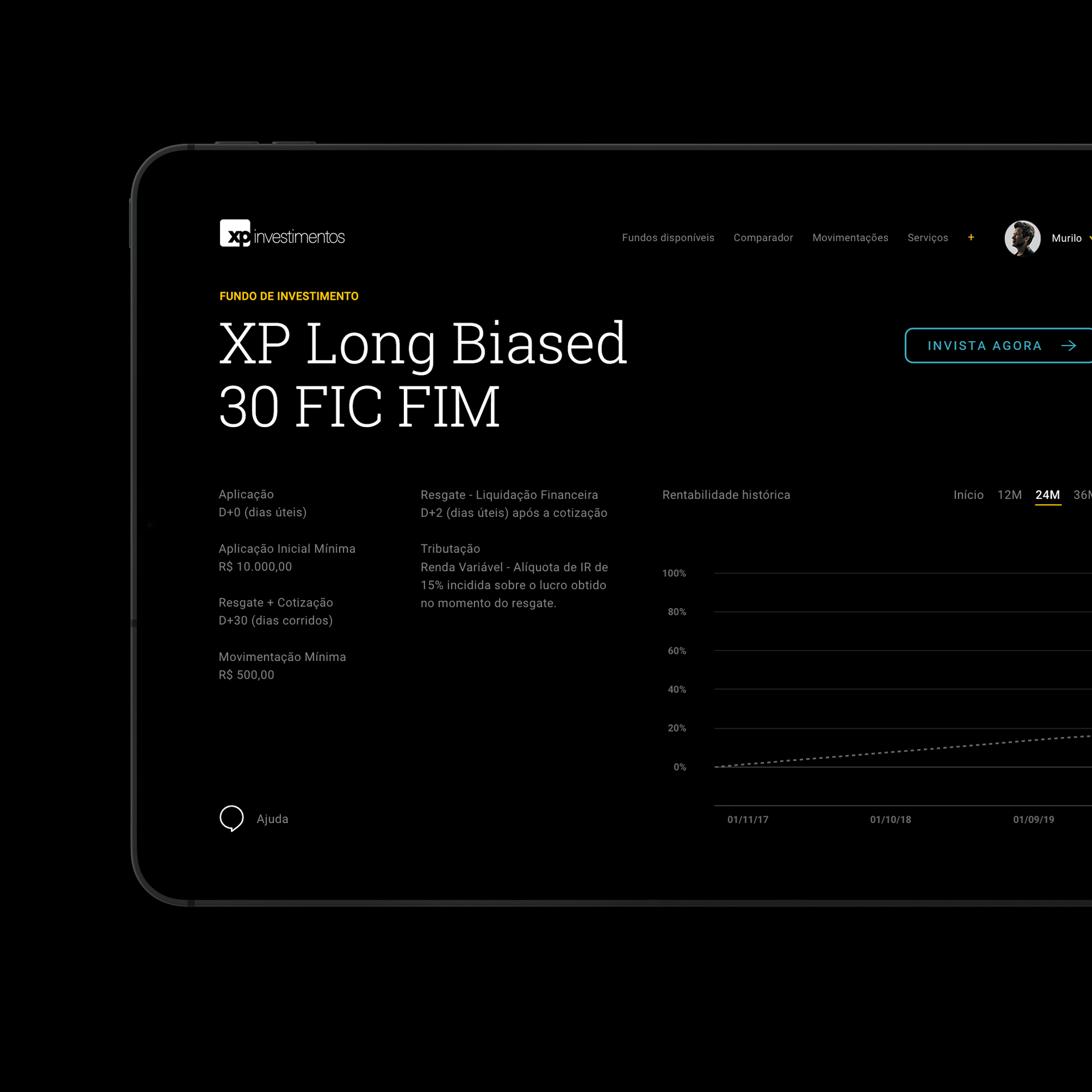
Following the central creative concept, the photography guidelines were designed to illustrate the brand’s connection with different kinds of clients and, most of all, show the many ways people can interact with XP’s advisory services.
—


Heading for the big fight —
AD CAMPAIGNS
The rebrand was later followed by two advertising campaigns created in collaboration with Grey Brasil, which introduced the new tagline “Mudando para Sempre seu Jeito de Investir“ (Changing Forever your Way of Investing).
The first campaign featured Brazilian actor and influencer Murilo Benício driving attention to XP’s cost-free advisory service.
For the second one, Luciano Huck – one of Brazil’s most famous TV presenters who had been starring bank campaigns for over a decade – agreed to switch to XP and record an interview giving his testimony against banks and their lack of investment expertise.
—
Turn on CC for English Subtitles


Turn on CC for English Subtitles


The results —
From the rebrand debut until late 2018, XP Investimentos’ brand awareness grew 30% and experienced a 12% increase in preference, becoming the most recalled investment brand among its target audience.
Leads grew 80%, and account openings increased by 60% during the first three weeks after the second campaign was launched. Big corporate banks left their comfort zone and reviewed their efforts to match XP’s communication.
The case was also awarded a Silver Effie in the “David vs. Goliath” category, which puts the spotlight on emerging brands making inroads against established leaders.
SOURCE: ILUMEO BRASIL AND XP INC.
—

“Not a long time ago, banks used to reject concepts like investment advisory and product diversity. Today, tables have turned.”