
Strategy, tone of voice, visual identity overhaul and advertising for a brand that helps Brazilian stock traders unleash their maximum potential.
MADE AT XP INC. IN 2017, 2018 / ROLE: CREATIVE DIRECTOR, LEAD DESIGNER, BRAND STRATEGIST / CLIENT: XP INC.
—
Acquired by XP Inc. in 2015, Clear was meant to fill the gap left by the flagship brand XP Investimentos, which had converted from a brokerage firm to an investment advisory company. While XP was losing traders to specialised brokerage businesses, Clear’s clients from before the acquisition were concerned that the brand would lose the agility and innovation of a startup.
There was an opportunity to strengthen Clear’s brand and help XP Inc. maintain its client-base at the same time.
From 2017 to 2018, I was responsible for rebranding Clear in the Brazilian market, delivering a comprehensive brand book and effective advertising.
Besides the new positioning and brand pillars, the overhaul involved a refreshed logo, a reviewed tone of voice and an all-new visual identity inspired by stock market elements.

Previous Logo and Brand Identity

New Brand Assets
Fusion: tools and thrill —
STRATEGY AND CONCEPT
Clear is meant to be the true home of stock traders. The new positioning — which resets Clear as a brand made for traders, by traders — is followed by the key creative concept “Fusão: Ferramenta e Sensação” (Fusion: Tools and Thrill).
This strategy represents the spirit of trading and the feeling of knowing the exact moment to push the button.
—


Virtuous contrast —
LOGO
The logo had its colours updated for a cleaner, more futuristic look while new variations were developed to make the symbol contrast better with different backgrounds. The “Corretora” tagline had its tracking adjusted to better align with the remaining elements.
—


Glowing energy —
COLOURS
Following the logo's palette, the identity's contrasting tones refer to concepts of energy and sobriety, reinforcing the dynamism of Clear's area of expertise.
—


Technology. Shaped —
TYPOGRAPHY
With elegant and straightforward forms that allude to technological environments, the Exo 2 and Titillium typefaces enhance the clarity and objectivity of Clear's tone of voice.
—


The movement of trading —
GRAPHICS
The diagonal graphic element is made from the symbol's angles and serves multiple purposes, from splitting layouts to masking images. The sense of motion that it gives is suitable to depict the stock market’s ever-changing nature.
—


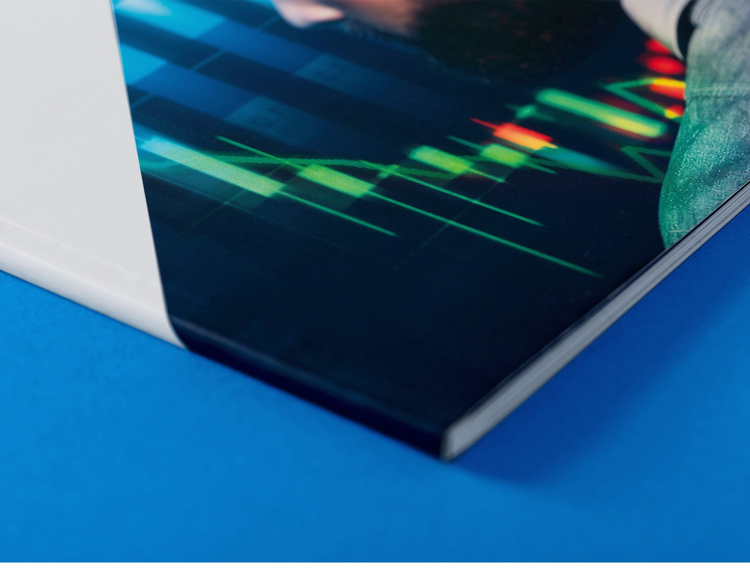
Information immersion —
PHOTOGRAPHY
The brand’s photographic expression symbolises the perfect balance between technological precision and human intuition. To represent this merging, images blend illustrations of trading graphs with pictures of Clear’s clients and analysts.
—


Portraits — Before and After
Taking an unprecedented step —
AD CAMPAIGN
To support Clear Corretora’s innovation pillar, the rebrand was launched alongside an integrated advertising campaign communicating that Clear was now the first brokerage firm in the country to offer zero-fee trading. The campaign was created in collaboration with Brazilian-based agency F.Biz.
—
Turn on CC for English Subtitles


The results —
From the rebrand debut until late 2018, Clear’s brand grew 16% in awareness and 7% in preference. Account openings increased by 40% while the number of stock trades brokered by Clear tripled right after the campaign was launched.
SOURCE: ILUMEO BRASIL AND XP INC.
—
“The new brand guidelines give a very strong statement of who we are and how to communicate ourselves. They also make it very simple for internal and external stakeholders to understand our purpose.”